Client: Punchcut for Samsung
Role: Senior Visual designer
I was brought on as a freelance designer to work with the multi-talented group at Punchcut to create an interface specifically dealing with cloud services for the new Samsung devices.
Our goals were to achieve the following-
BEAUTIFUL INTEGRATION: Samsung devices and services deliver exceptional experiences everywhere.
CONTINUOUS, NOT CONSISTENT: Tailor the experience to devices rather than making the UX consistent everywhere.
CONTENT-FIRST: Files not folders. Put the focus on content and create a UX that gives people tools to create and enjoy.
GRACEFUL DISCONNECTION: When connection is lost, users can still accomplish their task.
PEOPLE-CENTRIC: Sharing and connecting is a “people-first” over “channel-first” experience, acknowledging that channels are always evolving and new ways to communicate appear.
The screens shown are as follows:
EXHIBITION
Key Features: PhotoSync / Smart Albums / Related Media / Direct Sharing
All albums landing page / Album highlight info-Squaw Valley / Album page-Squaw Valley with Share tab on / All albums landing page in mobile layout / Exhibition motion example
HUDDLE
Key Features: Group Status / Group Messaging / Group Screenshare / Communication
Huddle timeline-initial concept / Huddle-Work(Acme) timeline / Huddle-Family timeline / Timeline-Scroll motion (past) / Timeline-Refocus (past) / Timeline-Current / Message focus / Huddle motion example
WORKSPACE
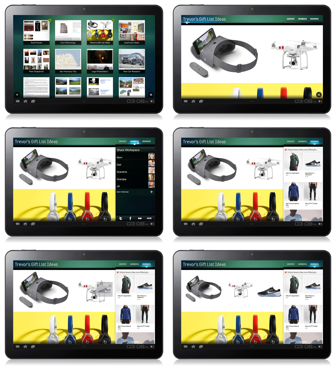
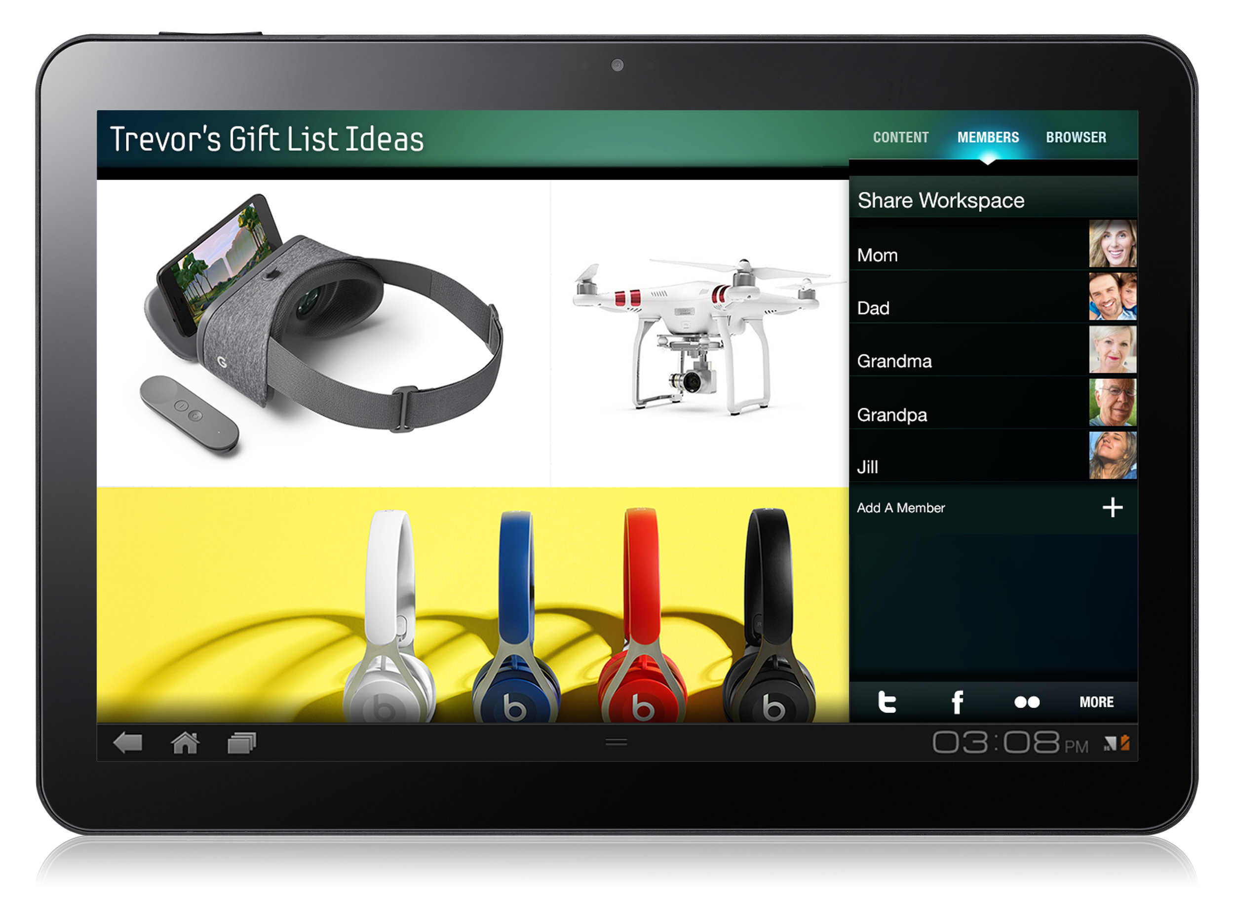
Key Features: Multimedia Scrapbook / Web-Clipping / Collaboration
All projects landing page / Project page-Trevor's Gift Ideas / with Share tab on / with Browser tab on / Project page-Scott House with browser tab on / Project page-Scott House in mobile layout / Workspace motion example


